Kara Connect
Web & User Interface design, Branding, Illustration
2020
![]()
Kara Connect is a well-being platform that enables employees to access coaching, counselling, therapy and other wellness services from experienced and accredited providers. During the height of the pandemic, they saw a surge in health providers who needed their platform to stay connected and provide care and services to their clients. They needed an expanded brand system to help them create a coherent and easy-to-use website for professionals and clients. We created a new color system, iconography and backdrops that echoed the friendly yet cutting-edge voice of Kara.
Role: Designer & Creative
Credits: Art Direction & Design, Connor Muething (karlssonwilker)
Web & User Interface design, Branding, Illustration
2020
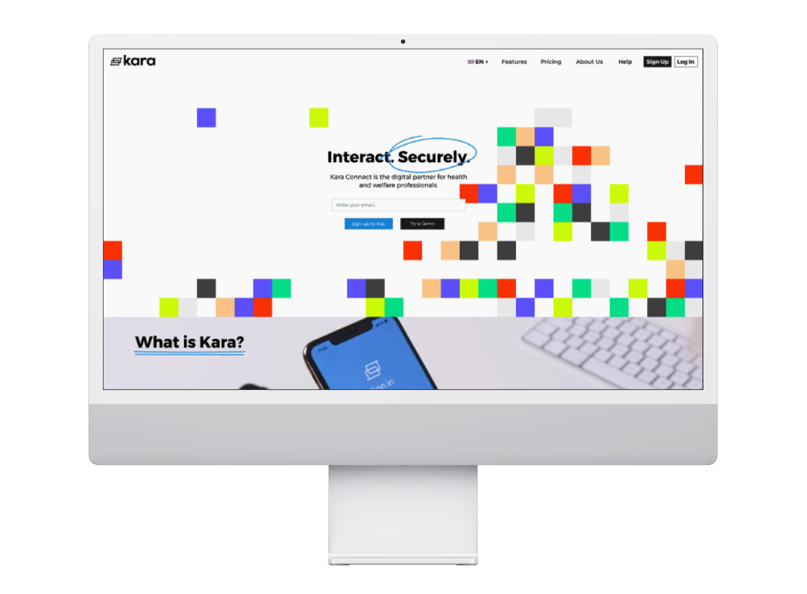
Kara Connect is a well-being platform that enables employees to access coaching, counselling, therapy and other wellness services from experienced and accredited providers. During the height of the pandemic, they saw a surge in health providers who needed their platform to stay connected and provide care and services to their clients. They needed an expanded brand system to help them create a coherent and easy-to-use website for professionals and clients. We created a new color system, iconography and backdrops that echoed the friendly yet cutting-edge voice of Kara.
Role: Designer & Creative
Credits: Art Direction & Design, Connor Muething (karlssonwilker)

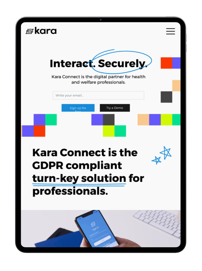
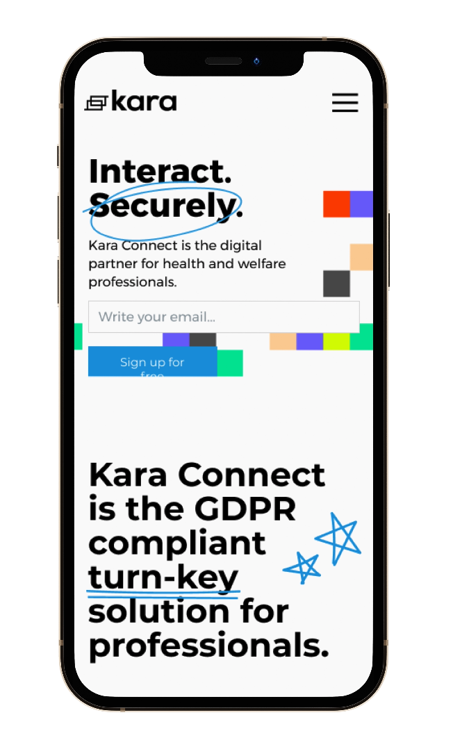

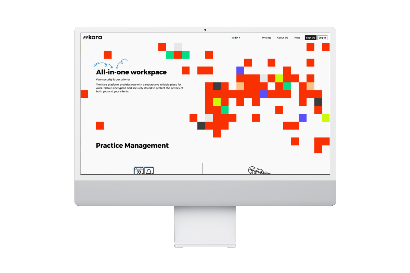
We picked an identifying color for each of the core pillars of the platform.
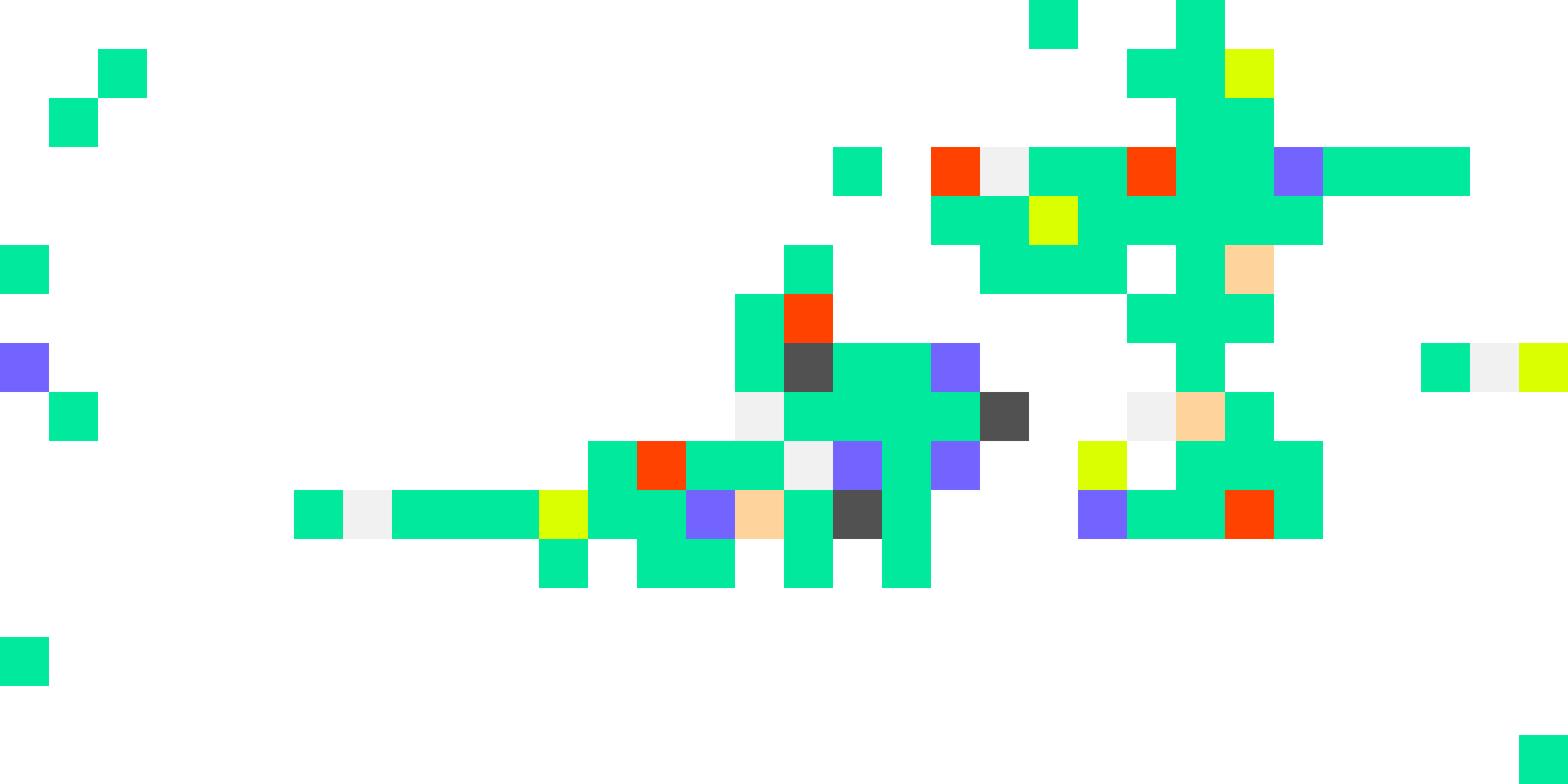
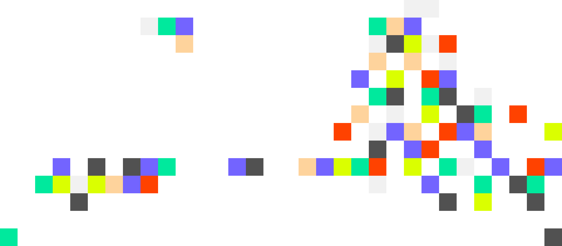
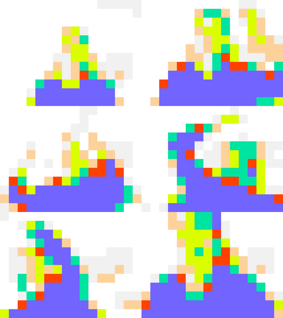
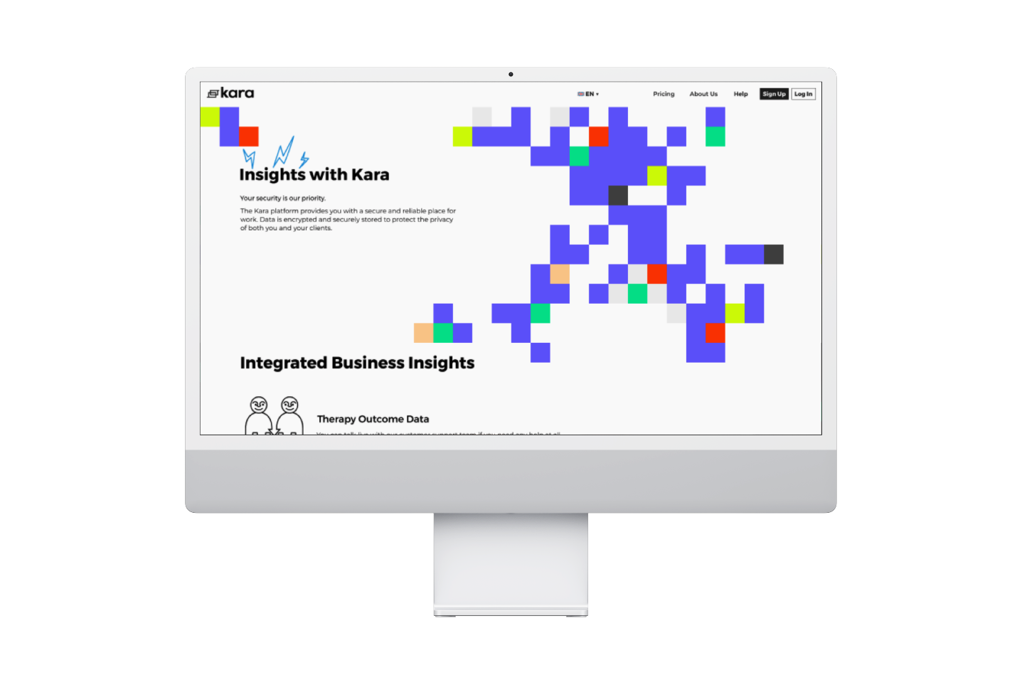
A pixel arrangement system used on the landing and subpages was created, based on experiments with tracing human movement in front of the screen.
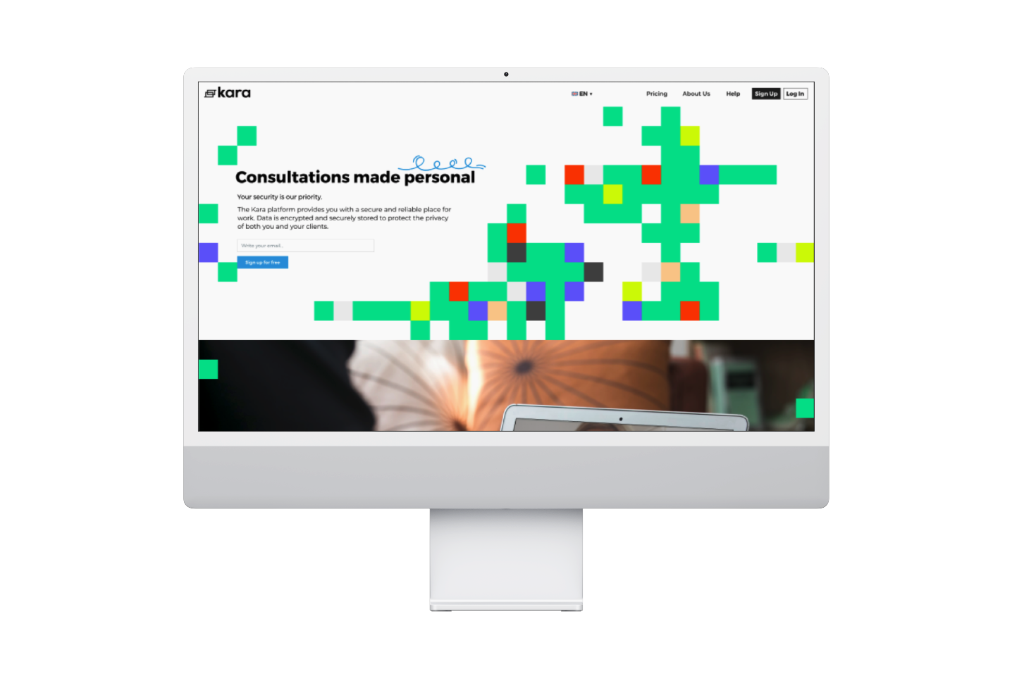
Individual backdrops were created for each of the subpages, with the dominating color being one that corresponds to the subpage.
Individual backdrops were created for each of the subpages, with the dominating color being one that corresponds to the subpage.

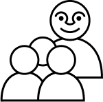
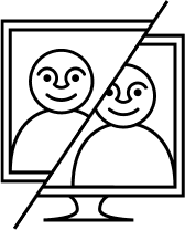
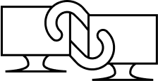
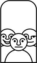
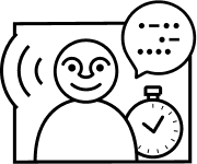
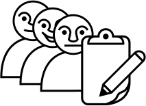
A set of icons was also produced specifically to address the need for identifying and explaining the process of telecommunication, and presenting a friendly face for users who need assistance on the platform.






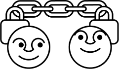

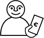
The core team at Kara expressed the need for flexiblity and personalization within the site itself -- we created a set of doodles that could be used all around the site. This helped them create a playful set of titles for each page, making dry and text heavy pages less of a chore to read.


